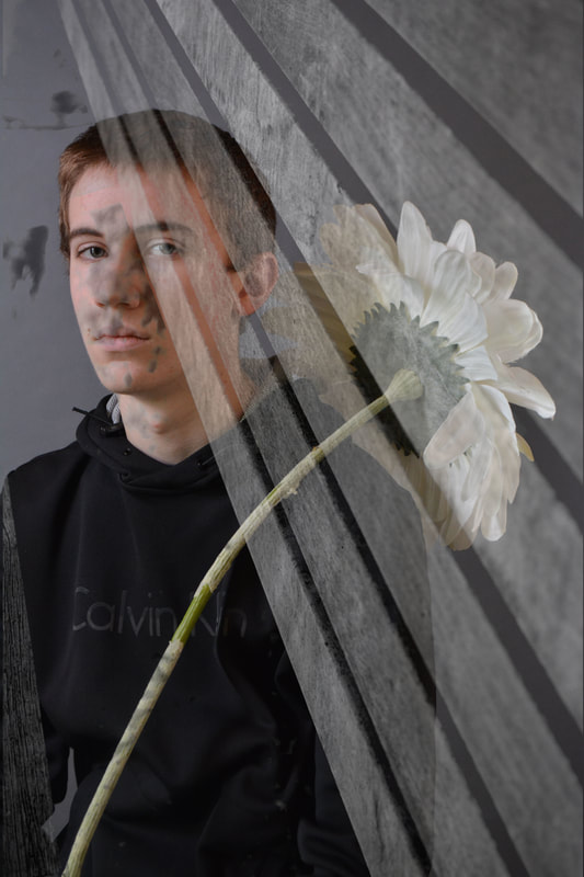
Why did you select to combine the images you chose?
I picked those two images because they compositionally made sense as they both follow the law of thirds. Ryan is on the left third whereas the bench is on the right third.
What message or mood is conveyed by their combination?
A rather somber mood is conveyed due to the serious expression on Ryan's face as well as the black and white photo of a bench that was layered on top.
What part(s) of your image do you feel were particularly successful? Why?
I feel like the flower Ryan was holding was successful in helping me layer the photo because it allowed me to see the difference between the two layers and thus determine the best possible opacity.
What would you like to manipulate further/touch-up?
If I could change anything, I would probably get a better photo of a bench where it takes up the whole photo rather than the bench seeming that it was only layered on one half of the photo.
